I designed and art directed packaging that told Ripple’s story at a glance, from new product lines to refreshed labels. It was all about making the brand feel bold, clear, and consistent whether it was on the shelf or in someone’s kitchen.
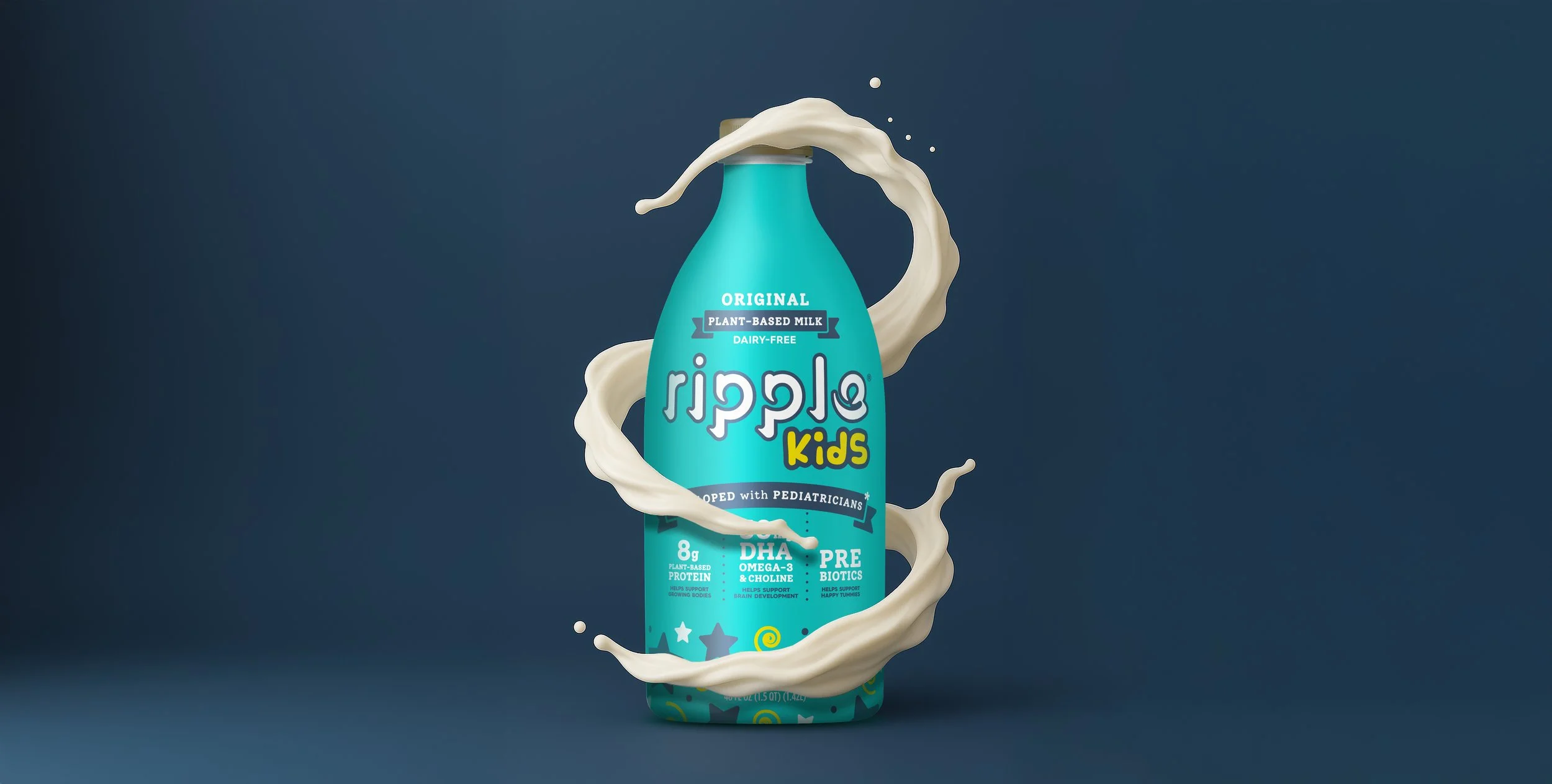
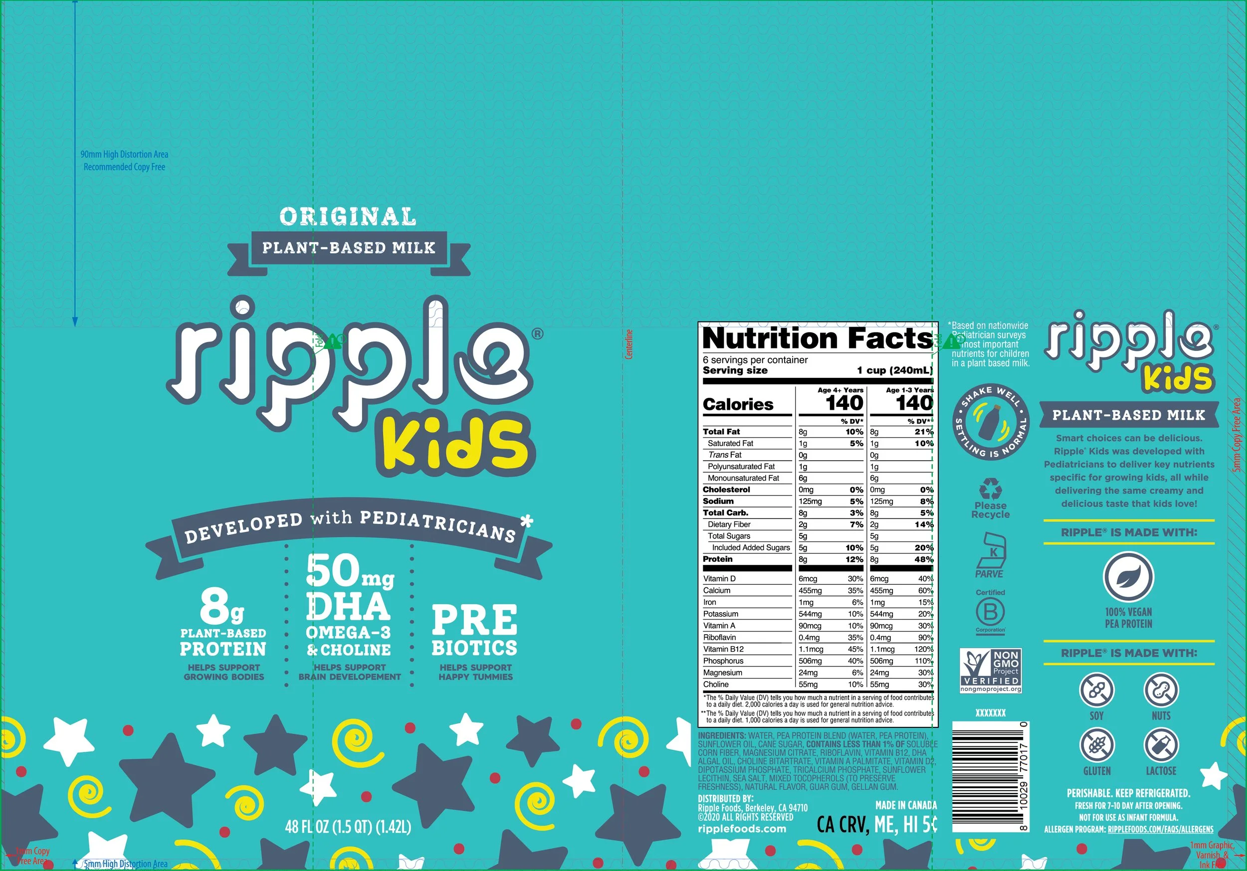


Project: Ripple Kids
Role: Designer & Implementation
Scope: Concept to Full Roll Out
The Challenge: Take a modern, minimalist brand and create its first-ever kids label. It needed to feel fun enough to grab a toddler’s attention and smart enough to earn a parent’s trust.
The Work: I designed the label from scratch with one goal in mind: make it look like something a kid would actually choose. It needed to feel playful and energetic without losing the clarity and confidence of the Ripple brand.
The Result: Ripple Kids became (and still is) the company’s top-selling product. After Ripple rebranded, we got a letter from a mom saying her son was devastated his “star milk” was gone. It was a reminder that design has the power to connect, even if it’s just with a kid and his favorite milk.


Project: Ripple On-the-Go Labels
Role: Designer & Implementation
Scope: Concept to Full Roll Out
The Challenge: On-the-Go started as part of our kids line, but when we moved kids to the 48oz bottle, we needed this SKU to grow up. It had to appeal to a wider audience and feel a little more flavor-forward without losing that clean Ripple look.
The Work: I redesigned the label from scratch to feel more dynamic and less kid-focused. This was the first Ripple product to feature liquid on the label, which gave it a sense of flavor and energy we hadn’t explored before. It still felt like Ripple, just with a little more life.
The Result: The updated design helped Ripple step into the single-serve space with a more flexible, grown-up feel. It looked just as at home in a lunch bag or gym tote as it did in the fridge.


Project: Ripple Yogurt v.2 Labels
Role: Designer & Implementation
Scope: Concept to Full Roll Out
The Challenge: Ripple Yogurt was ready for a refresh. The original version didn’t quite hit the mark, and we knew there was an opportunity to make it feel more premium and more appealing, without straying from the core of the Ripple brand.
The Work: I redesigned the labels with a focus on flavor and simplicity. We introduced bold, color-coded lids for each variety, paired with a dark blue tone on the cups to help them stand out. The cups also switched to a soft matte finish, which gave the whole product a more elevated feel. Everything from the layout to the textures was built around taste appeal and shelf presence.
The Result: The new design stood out in a crowded category of mostly white and beige cups. It felt modern, clean, and more like something you’d actually want to grab. The updated look gave Ripple Yogurt a stronger voice and presence in the non-dairy set.


Original Design 2015-2020

The “Swirl” Rebrand 2020-2024

The “Wave” Refresh 2024-Present
Project: Ripple Brand Refresh (x2)
Role: Art Director & Implementation
Scope: Concept Support to Full Rollout
The Challenge: Ripple was getting lost on shelf. The label was clean and minimal, but it didn’t say much about who we were or why someone should pick us up. Most people didn’t know what Ripple was, how it tasted, or how it made them feel. We needed to use design to tell that story. It had to show movement, energy, and flavor in a way that felt true to the brand and helped us stand out.
The Work: The first brand refresh, “The Swirl,” was all about movement. We wanted the label to feel like a ripple in motion, something fluid, energetic, and alive. It was a way to visually show people what Ripple stood for, while also keeping key benefits front and center for plant-based shoppers.
But something was still missing. The second refresh, “The Wave,” focused on taste. We didn’t want to walk away from what we had already built, but we knew we needed to add a milk-like element to make the product feel more delicious and inviting. We kept the benefits clear and intentional, but pulled back on anything that felt too busy. The goal was to stand out without overwhelming, especially as the plant-based space got more crowded.
The Result: The updated labels stood out on shelf in a very crowded category. They felt clean, modern, and more inviting. I helped make sure that evolution carried through across every touchpoint, from packaging to print to digital. Also yes, I gave the “i” its dot. Everyone deserves to feel complete.