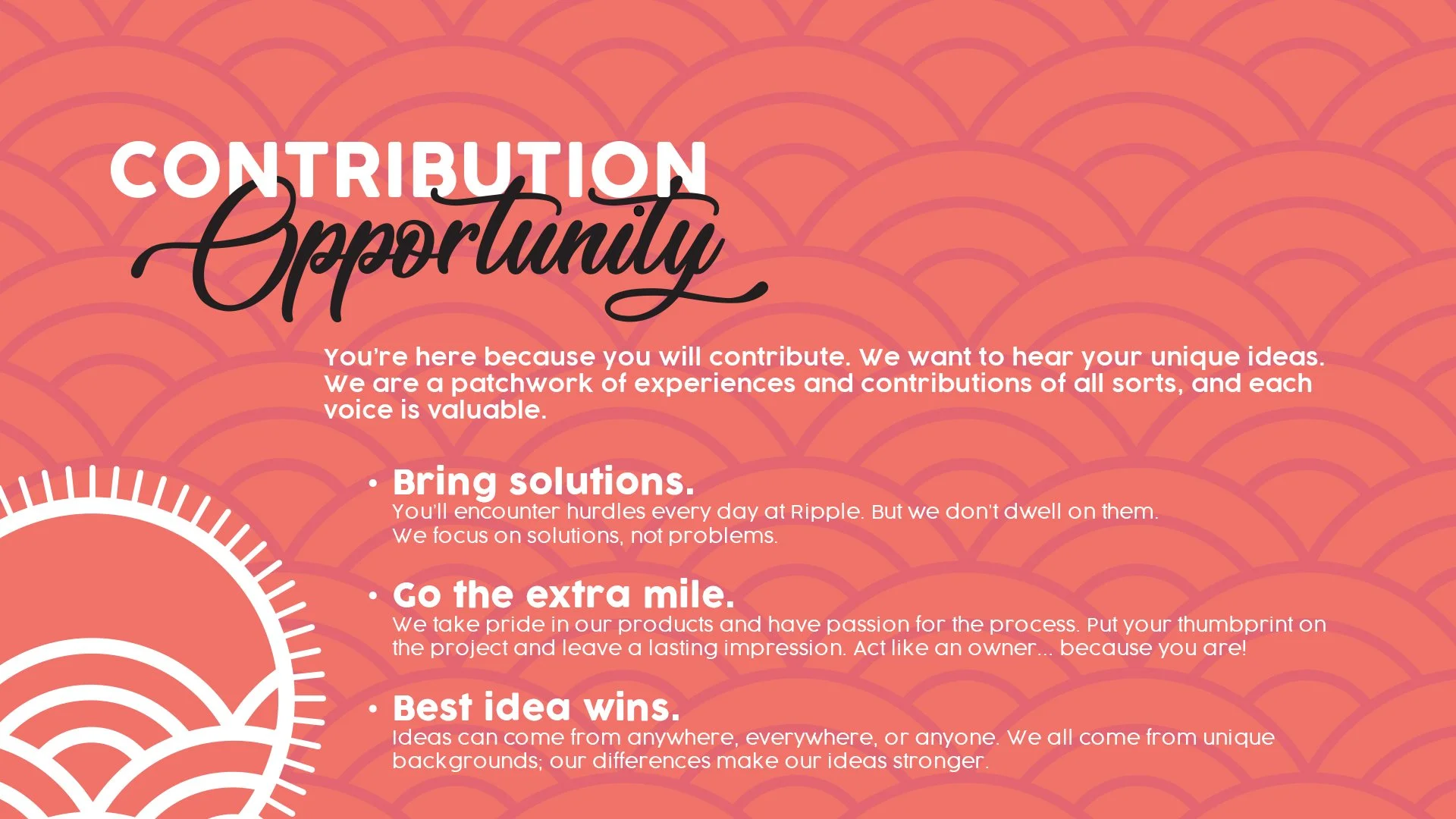
This project was all about turning Ripple’s core brand values into something people could actually see and feel. The goal was to create a design system that felt true to the brand while giving each value its own sense of importance. I leaned into Ripple’s original colors, patterns, and tone to keep everything familiar and cohesive.


POCKET-SIZED PURPOSE
I designed this brand values booklet for Ripple, inspired by the feel of a Pantone swatch. Each card highlights a core value with equal weight and personality. It was handed out to all employees and stuck around for years as a quick, meaningful reminder of what Ripple stands for.


These designs were also used throughout Ripple HQ as large posters and shared digitally in internal decks and team presentations. It was a simple, effective way to keep our brand values front and center, whether someone was walking through the office or presenting to leadership.